
Are you looking to give your home a new look and feel? Have you been scouring the internet for hours for the perfect interior color scheme for your home decor but still finding it hard to decide? Well, look no further! This article will take you through some of the top interior color schemes that can help make your space look chic and beautiful. Get ready to be inspired!
Introduction
As most of us are spending more time at home these days, we’re bound to get a little bored with our surroundings. If you’re looking for a change but don’t want to commit to painting your entire house, why not start small by experimenting with different color schemes in each room? To help you get started, we’ve gathered some of the top interior color schemes that are popular right now.
Neutrals with a Pop of Color
This scheme is perfect if you want a versatile space that can be easily dressed up or down. Stick to neutral colors like white, cream, and gray for the majority of the room, then add in a pop of color with accent pieces like throw pillows, blankets, or artwork.
Monochromatic
Monochromatic schemes are classic and elegant. To pull this off, choose one color and use different shades and tones throughout the space. For example, if you want to use blue, pair light blue walls with dark blue accents or vice versa.

Black & White
You can’t go wrong with a classic black and white color scheme. It’s timeless and works well in any type of space. To keep it from feeling too stark, add in some texture with rugs or curtains.
Pink & Green
This fresh combo is perfect for spring and summertime. It evokes feelings of nature and growth and can be used in different rooms.
Have a look at this guide that to know more about the colors and how it can affect enhance the quality of our lives.

Basics of Color Theory
Choosing a color scheme for your home decor can be a daunting task. There are so many different colors to choose from and it can be hard to know which ones will work well together. Luckily, there are some basic principles of color theory that can help you create a beautiful and cohesive space.
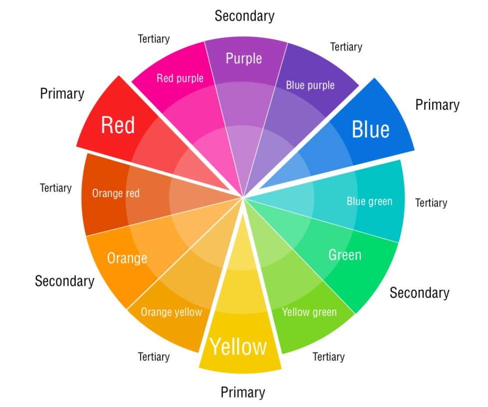
The first thing to keep in mind for interior color scheme is the color wheel. This is a tool that shows how colors relate to each other and can be used to create pleasing color combinations. The three primary colors are red, yellow, and blue. These colors cannot be created by mixing other colors together and are the starting point for all other colors on the wheel. The secondary colors are orange, green, and purple. These are created by mixing two primary colors together. For example, orange is created by mixing red and yellow together.
The next thing to consider is the value of each color. This refers to how light or dark a color appears. A light blue might have a low value while a dark blue would have a high value. You can use this to create contrast in your space by using a light color against a dark background or vice versa.
Once you have an understanding of the basics of color theory, you can start experimenting with different combinations to see what works best in your space. Don’t be afraid to mix different shades of the same color together or try out bolder Statements like pairing contrasting colors like black and white. With a little trial and error, you’ll be able
Colors for Small Spaces
It can be tricky to know what colors to use in small spaces, but there are some general rules you can follow to help you choose the perfect hues for your room.
First, consider the light in the space. If it’s a north-facing room with little natural light, you’ll want to leaning towards lighter colors to help make the space feel more open and airy.
Conversely, if you have a south-facing room that gets lots of sunlight, you can go with bolder, richer colors without worry that the space will feel too closed in.
Another thing to keep in mind is the furniture and fixtures in the room. If your space is already full of dark wood pieces or metal accent ices, you’ll want to avoid using colors that are too similar, as it will create a heavy and uninviting atmosphere. Instead, opt for light wall colors and bright accents to balance out the darkness and add visual interest.
Finally, think about the feeling you want to create in the space. Do you want it to be calm and serene? Warm and inviting? Energetic and fun? The color scheme you choose should reflect this overall goal.
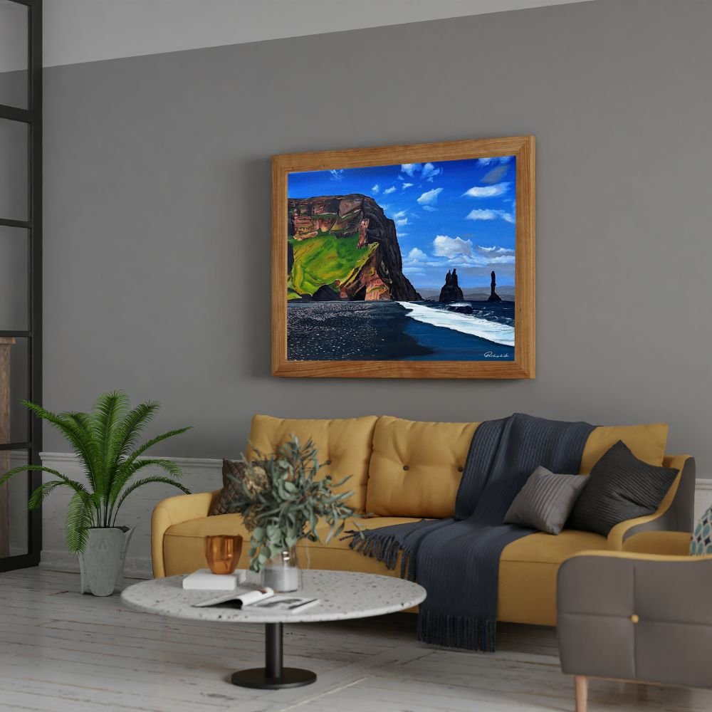
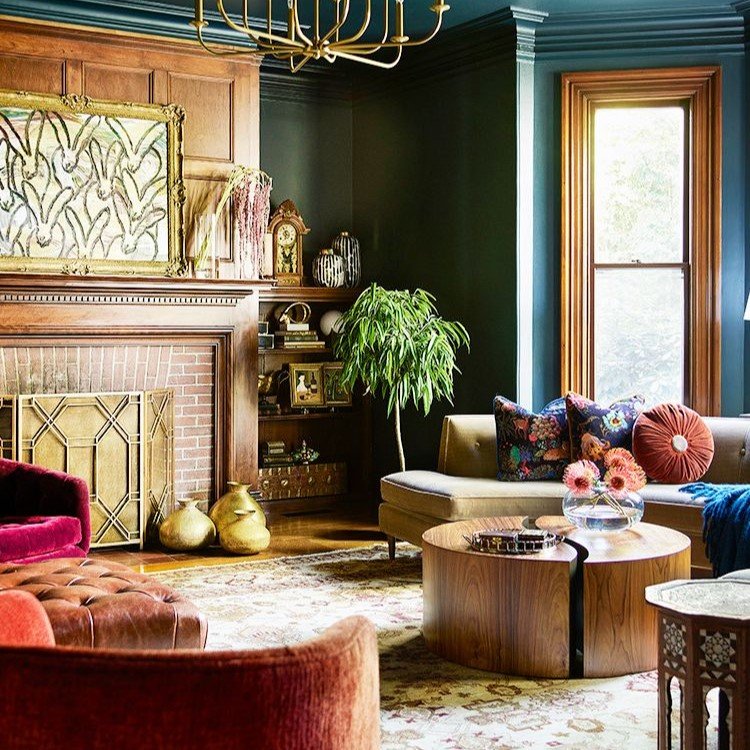
Monochromatic Color Scheme for Living Rooms
A monochromatic color scheme for living rooms can create a sense of harmony and visual interest in your space. To achieve this look, start with a color you love and then build upon it with different shades, tones, and tints of that same hue. For example, if you’re drawn to the calming effects of blue, consider using light blue walls as your base and then adding in pops of navy and robin’s egg blue throughout the room. Not only will this give your living room an elegant appearance, but it can also help to make the space feel larger and more serene.
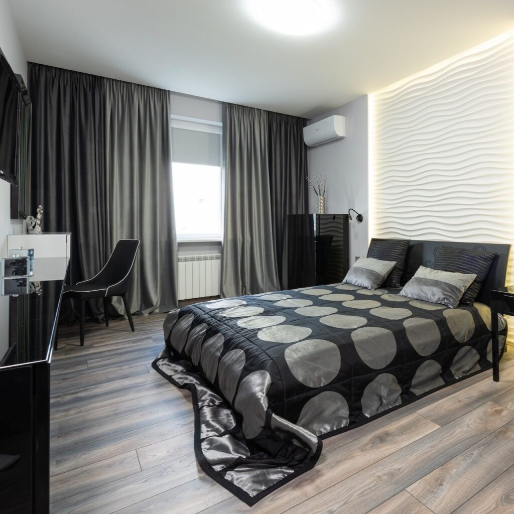
Earthy and Neutral Color Schemes for Bedroom
Earthy and neutral colors are perfect for creating a calming, relaxing space in your bedroom. These colors can be used on walls, furniture, bedding, and accessories to create a serene environment.
Neutral colors such as white, cream, taupe, and gray are perfect for painting walls or using on furniture. These colors will help to create a tranquil atmosphere in your bedroom. You can use these colors alone or mix and match them to create your own unique color scheme.

Bedding is another great way to incorporate earthy tones into your bedroom decor. Look for sheets, duvets, and quilts in shades of ivory, tan, brown, and green. These colors will add a touch of nature to your space and help you relax at the end of the day.
Accessories are the perfect way to add pops of color to an earthy or neutral color scheme. Look for lamps, vases, throw pillows, and wall art in bold hues such as orange, red, yellow, or blue. These colors will add personality to your space and help tie together your overall design.
Bold Color Schemes for Kitchen
It’s no secret that color can have a big impact on our mood and emotions. So, when it comes to creating a bold and inviting kitchen space, choosing the right colors is key. Here are some of our favorite bold color schemes for kitchens:
- Black and white: This classic combo is both timeless and trendy. Plus, it’s easy to mix and match different textures and patterns with these colors to create an interesting and unique space.
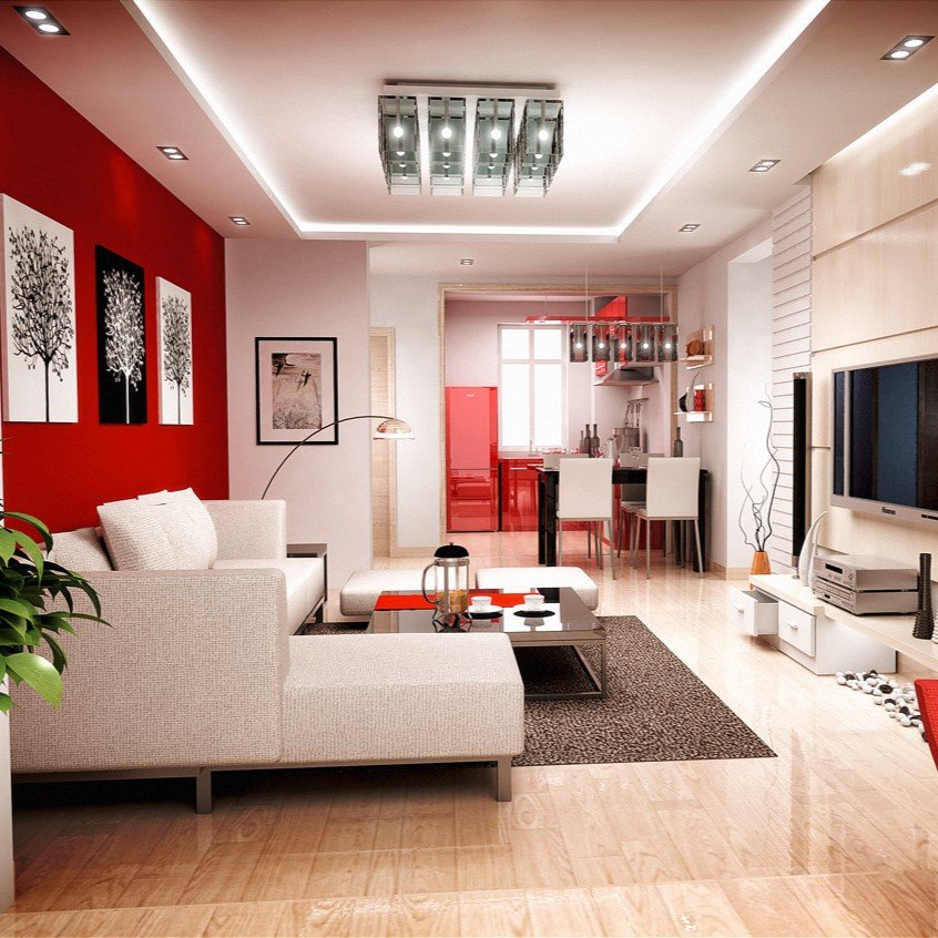
- Red and white: This vibrant color combination is perfect for creating an energetic and exciting kitchen space. Red is also known to stimulate appetites, so it’s perfect for entertaining or cooking large meals.
- Yellow and blue: This cheerful combo is perfect for making a kitchen feel bright and sunny. It’s also a great choice for those who want to add a pop of color without going too overboard.
- Orange and green: This fun and fresh combo is perfect for adding some personality to your kitchen space. Plus, orange is known to boost energy levels, so it’s perfect for early morning cookouts or late-night snacks.

Traditional Color Schemes for Dining Room
There are a few tried and true color schemes that always look great in a dining room. If you’re looking for a classic look, stick to one of these combinations.
- Navy and white is a timeless combo that can be dressed up or down. It’s perfect for both formal and casual dining rooms.
- Black and white is another chic option that works well in all types of dining rooms. This scheme is especially versatile because you can add pops of color with your tablecloth, place mats, or other accessories.
- Gray and white is a trendy choice that works well in both contemporary and traditional spaces. To add some visual interest, consider using different shades of gray or adding a pop of color with your accents.
- Brown and white is a classic combination that lends itself to many different styles of dining rooms. For a more traditional look, use rich brown tones. For a more modern space, opt for lighter browns or even tans.
Tips and Tricks on How to Choose the Right Color Scheme
When it comes to choosing a color scheme for your home, there are many factors to consider. The following tips and tricks will help you choose the right colors for your space:
- Consider the mood you want to create. Colors can evoke certain emotions, so it’s important to choose a scheme that fits the mood you’re trying to create in your home.
- Take into account the natural light in your space. Certain colors will look different in different lighting, so it’s important to see how the colors you’re considering will look in your specific space.
- Don’t be afraid to experiment! Sometimes the best way to find the perfect color scheme is to experiment with different combinations until you find one that you love.
- Keep in mind that trends come and go. While it’s important to stay up-to-date on current trends, don’t be afraid to stray from them if you find a combination that you love and that works for your space.
- Seek out professional help if needed. If you’re having trouble choosing an interior color scheme, there’s no shame in seeking out the help of a professional designer. They can help you narrow down your options and find the perfect colors for your home
Conclusion
Interior color schemes can be used to give your home the appeal that you are looking for. By exploring various combinations of these popular colors and shades, you can create an atmosphere in each room that expresses your unique style and taste. Whether it is a classic monochromatic look or a modern mix of bold tones, explore our top interior color schemes tips to find what works best for your decorating needs.


Pingback: Top Indoor Home Decor Color Schemes for a Stylish and Harmonious Space